Mobile Nav on Desktop

$0.00

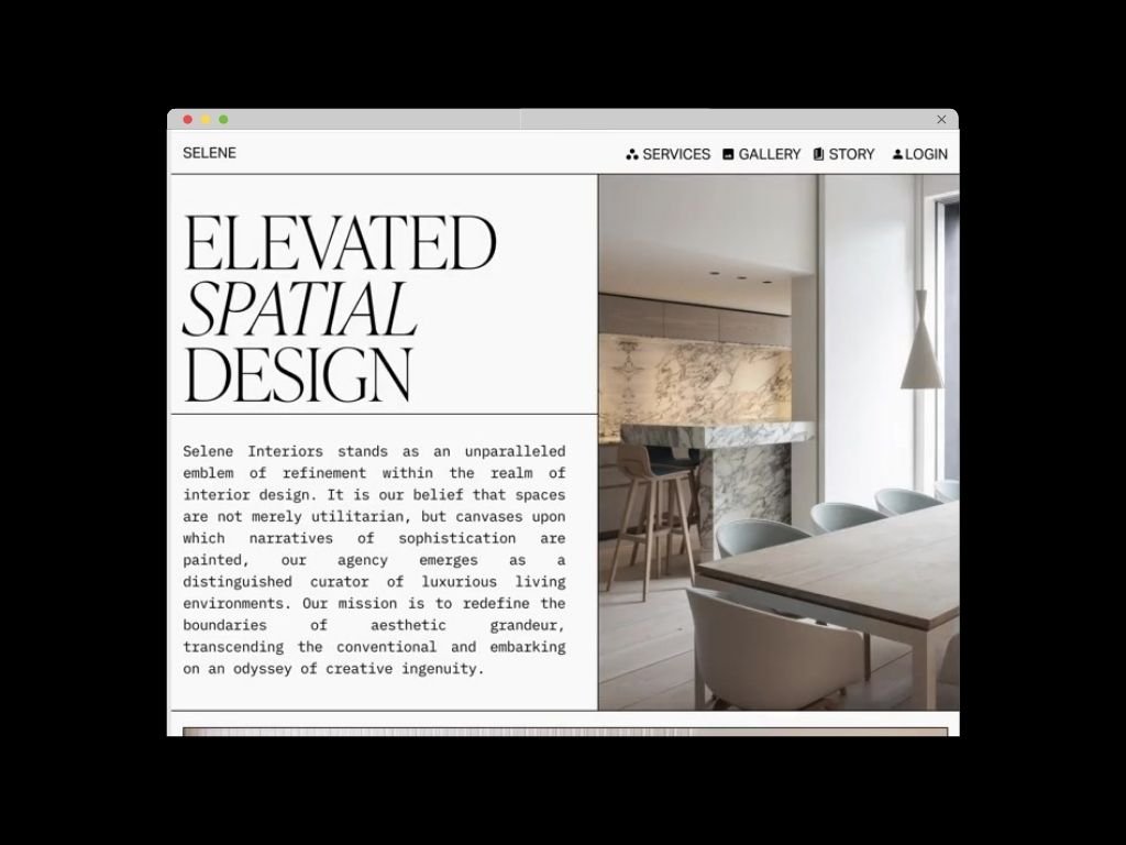
This code snippet enables the mobile menu of a Squarespace site on the desktop version.

Add To Cart

This code snippet enables the mobile menu of a Squarespace site on the desktop version.

This code snippet enables the mobile menu of a Squarespace site on the desktop version.

Mobile Nav on Desktop in Squarespace Code Snippet

CODE SNIPPET

Copy this code and add it to the CSS panel.

.header-nav-list {
  display: none;
} 
.header-burger {
  display:flex !important;
}
.header--menu-open .header-menu {
  opacity: 1;
  visibility: visible;
}
.header-menu{
  transition: all .3s ease;
}
  • Plan: Business or Higher

    Compatibility: 7.1

    1. Copy the code snippet →

    2. Go to Pages > Website Tools > Custom CSS

    3. Paste the code snippet, and save

  • No customization needed.

  • Any changes you make in the mobile menu will be visible on the desktop.

Found this code helpful?
Send a Tip! ☺️
Glowing Navigation Links
$4.49
Add Icons to Navigation with Google Material Icons
$20.00
Fade in Nav Folder Snippet
$0.00